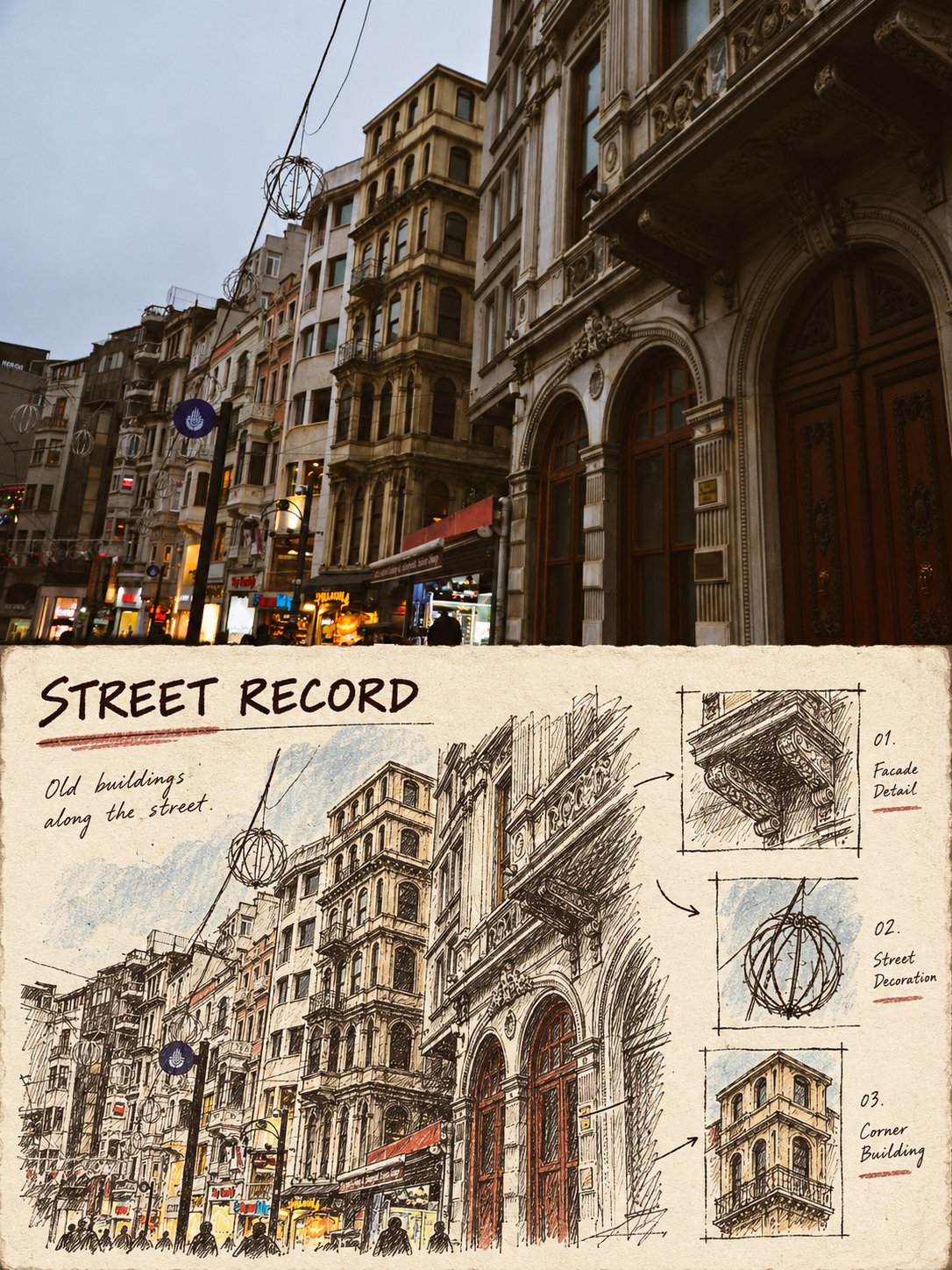
档案卡现场手绘记录风上下对比图
- 模型
- ChatGPT
- 来源
- @Hamburgerai
- 收录
- 2026-10-13
提示词
3,592 字
Use case: style-transfer
Asset type: Vertical top-bottom comparison style transfer poster
Primary request: Transform any input real photo into a "field hand-drawn archive card record style" top-bottom comparison transfer image.
Input images: The input photo is the sole source of truth, using only the subject, pose, quantity, structure, spatial relationships, and confirmable colors from the photo.
Scene/backdrop: The image is vertical with approximately a 3:4 ratio; the upper half completely retains the real photographic texture, original composition, and natural light of the input photo as a clear photo recording area; the lower half becomes an off-white, vintage archive card with slight fibers and old paper deckle edges.
Subject: No limit on subjects, can be people, animals, buildings, street scenes, nature, vehicles, interiors, food, or common objects; extract the most recognizable subject and two or three details from the original photo, do not fix the theme to ships or ports.
Style/medium: The lower half uses dark brown pen/marker lines, slight dry ink scratches, and a small amount of crayon or vintage screen-printed color blocks, like travel archive cards, field survey cards, or hand-drawn observation records on the back of old postcards; lines retain hand-drawn jitter, local repeated strokes, and uneven ink, do not make it a smooth vector illustration or a common filter.
Composition/framing: The lower half reorganizes the original photo information and does not copy the original framing proportionally: scale down the subject or magnify parts into archive illustrations, arrange a small number of local detail boxes, arrows, numbers, legends, or material fields around them; leave clear off-white breathing space, the layout looks like a complete physical card. A short English title, a short field related to the photo facts, and an extremely short observation can be added, but no long paragraphs of text.
Lighting/mood: The upper half is natural and real; the lower half has soft paper-surface light, a restrained vintage record feel, quiet and observational.
Color palette: Based on off-white, dark brown, grey-blue, or dark red, extracting only one or two low-saturation accent colors from the original photo; do not apply a fixed yellow-blue color scheme.
Materials/textures: Visible paper fibers, old card edges, slight printing misalignment, dry ink broken lines, handwritten fields, tiny numbers, and local color blocks; textures must participate in the composition, not just adding a grain filter.
Text (verbatim): Only generate short titles/fields/observation sentences explicitly specified by the prompt; if the location cannot be confirmed, do not fabricate place names, dates, coordinates, brands, URLs, or long paragraphs.
Constraints: The upper half must be a recognizable real original image; the lower half must be a hand-drawn archive reconstruction of the same photo content; strictly top-bottom partitioning, no side-by-side, no nine-grid, no multiple different photos, no "Original/AI" labels, no watermarks; maintain subject identity, quantity, pose, architectural structure, topographic relationship, and observation angle; the lower half must change at least two of: subject scale, cropping, information density, or spatial organization; the lower half must not be a mere isomorphic copy of the original image.
Avoid: Pure color grading, common photo filters, 3D rendering, cartoon templates, irrelevant travel icons, adding people or landmarks out of thin air, fake Chinese, QR codes, long paragraphs, or over-crowded sticker collages.
1,110 字
Use case: style-transfer
Asset type: 竖版上下对比风格转绘海报
Primary request: 将输入的任意真实照片制作成一张“档案卡现场手绘记录风”的上下对比转绘图。
Input images: 输入照片是唯一事实来源,只使用照片中的主体、姿态、数量、结构、空间关系和可确认的色彩。
Scene/backdrop: 画面为竖版约3:4比例;上半部完整保留输入照片的真实摄影质感、原始构图和自然光线,作为清晰的照片记录区;下半部变成一张米白色、略有纤维和旧纸毛边的复古档案卡。
Subject: 不限主体,可以是人物、动物、建筑、街景、自然、交通工具、室内、食物或普通物件;从原照片提取最具识别度的主体和两三个细节,不把主题固定为船或港口。
Style/medium: 下半部使用黑褐色钢笔/签字笔勾线、轻微干墨擦痕、少量蜡笔或旧丝网印刷色块,像旅行档案卡、现场勘察卡、老式明信片背面的手绘观察记录;线条保留手绘抖动、局部重复描线和不完全均匀的墨色,不要做成光滑矢量插画或普通滤镜。
Composition/framing: 下半部重新组织原照片信息,不等比例照抄原取景:把主体缩小或局部放大成档案插图,周围安排少量局部细节小框、箭头、编号、图例或材料字段;留出明确的米白呼吸空间,版面像一张完整的实体卡片。可加入一个短英文标题、一个与照片事实相关的短字段和一句极短观察,但不要大段文字。
Lighting/mood: 上半部自然真实;下半部是柔和纸面光、克制的复古记录感、安静而有观察意味。
Color palette: 以米白、黑褐、灰蓝或暗红为基础,只从原照片提取一至两种低饱和强调色;不要套用固定黄蓝配色。
Materials/textures: 可见纸纤维、旧卡片边缘、轻微印刷错位、干墨断线、手写字段、细小编号和局部色块;材质必须参与构图,不能只加颗粒滤镜。
Text (verbatim): 只生成提示词明确指定的短标题/字段/观察句;若无法确认地点,不编造地名、日期、坐标、品牌、网址或长段落。
Constraints: 上半部必须是可辨认的真实原图;下半部必须是同一照片内容的手绘档案重构;严格上下分区,不要左右并排,不要九宫格,不要多张不同照片,不要“原图/AI图”角标,不要水印;保持主体身份、数量、姿态、建筑结构、地形关系和观察角度;下半部至少改变主体尺度、裁切、信息密度或空间组织中的两项;下半部不得只是原图的同构临摹。
Avoid: 纯调色、普通照片滤镜、3D渲染、卡通模板、无关旅游图标、凭空新增人物或地标、假中文、二维码、长段落、过度拥挤的贴纸拼贴。