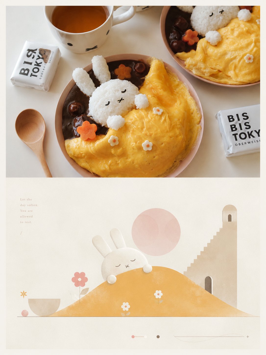
高级艺术设计海报几何极简诗意视觉寓言
- 模型
- ChatGPT
- 来源
- @xiaoxiaodong01
- 收录
- 2026-08-26
提示词
4,814 字
Better logic for processing the following text:
Please turn each photo I upload into an independent high-end design poster, no multi-image stitching, each photo output separately. The overall composition uses a 3:4 vertical layout, continuing the top-bottom dual-layer logic: the upper part is real photography, and the lower part is an artistic reconstruction based on subtext and allegory;

The upper part retains the original photo, keeping the subject's identity, structure, posture, real texture, natural light and shadow, and original color atmosphere, with only slight high-end photographic color grading to give it the texture of an art magazine, independent publication, and exhibition photography. To adapt to the frame, the environmental background can be naturally extended, but the subject must not be stretched, distorted, or changed.

The lower part extracts the most recognizable **subject, outline, posture, narrative relationship, and emotional metaphor** from the photo, not only reproducing "what is seen," but more importantly understanding "what the original image implies, symbolizes, and reminds people of," then reconstructing it into a **geometrically minimalist, poetically romantic, but structurally rigorous** graphic scene. Do not fully depict the original scene, nor copy realistic details, but only retain the core theme and visual logic that most validates the spirit of the original image, translating complex information into a few clear and meaningful forms, paths, landforms, architectural feelings, spatial layers, or symbolic objects, making people feel at a glance that it shares the same source as the original image, while feeling an elevated sense of allegory and poetry.

The composition should be built on **geometric order and rational structure**, with a Da Vinci-like sense of rigor: emphasizing proportion, axis, perspective, primary and secondary order, block-surface relationships, path guidance, and spatial balance. The subject can be transformed into simplified mountains, buildings, vessels, human figures, roads, platforms, domes, arches, discs, tree-like forms, or other symbolic geometric shapes, building a quiet and romantic "conceptual landscape" through a few key elements. The lower part should have a large amount of light-colored negative space and breathing room, with complex backgrounds actively deleted, leaving only the necessary field to support the theme and allegory, allowing the blank space, distance, and order itself to participate in the narrative.

Visual language adopts **geometric flat graphics + soft manual texture**: clear and generalized forms, restrained edges, simplified details, allowing a slight paper, powdery, or print-like feel, but avoiding a sticker, 3D, realistic, and over-decorated feel. The overall image has both the simplicity of modern graphic design and the poetic nature of romantic narrative illustration, like a dream map, memory landscape, or allegorical illustration constrained by rational structure.

Color palette continues the current logic: overall adoption of **soft, transparent, slightly desaturated high-end color systems**, with an extremely light, clean, near-white pale background as a large-area breathing field. Use **pale pink-blue, mist blue, sky blue, airy cold-toned blue** to create the main atmosphere, then use **ivory white, cream white, light beige, soft gray-green, architectural neutral colors** to maintain balance; a small amount of **blush pink, soft peach, dusty rose, or muted blush** can be added as local highlights to make the image more healing, poetic, and exquisitely layered. Avoid dirty gray, excessive contrast, high-saturation clashing colors, and cheap vintage feels.

The text does not preset fixed titles, numbers, locations, or languages, nor does it provide menu-style information. It should freely generate a very small number of truly meaningful characters, words, short sentences, or fragments based on the theme, emotion, allegory, memory, or cultural context of the photo, and naturally enter the blank area through high-end editorial layout. The text should be small, light, restrained, and exquisite, and can be arranged along axes, edges, paths, or around the subject, like notes, labels, or observational phrases in an independent publication, forming a quiet and clever relationship with the geometric composition.

Overall temperament should be like an independently published art travel journal or visual allegory manual: **minimalist, poetic, romantic, rational, restrained, with geometric order and conceptual beauty.** Avoid complete realistic landscapes, information stacking, complex decorations, overcrowded subjects, overly solid backgrounds, template-like poster feels, e-commerce illustration feels, cartoon feels, and cheap collage feels.
1,283 字
更好的逻辑处理如下文本:
请将我上传的每一张照片分别制作成一张独立的高级设计海报,不多图拼接,每张照片单独输出。整体采用3:4竖版构图,延续上下双层逻辑:上半部分为真实摄影,下半部分为基于潜台词与寓意的艺术化重构;

上半部分保留原始照片,保持主体身份、结构、姿态、真实质感、自然光影和原有色彩氛围,仅进行轻微高级摄影调色,使其具有艺术杂志、独立出版物与展览摄影质感。为适配画幅,可自然扩展环境背景,但不得拉伸、扭曲或改变主体。

下半部分提取照片中最具识别性的**主体、轮廓、姿态、叙事关系与情绪隐喻**,不仅重现“看见了什么”,更要理解原图“在暗示什么、象征什么、让人联想到什么”,再将其重构为一种**几何极简、诗意浪漫、但结构严谨**的图形化场景。不要完整描摹原场景,也不要照搬现实细节,而是只保留最能成立原图精神的核心主题与视觉逻辑,把复杂信息转译成少量清晰而有意味的形体、路径、地貌、建筑感、空间层次或象征性对象,让人一眼感到与原图同源,同时感受到被提升后的寓言感与诗意。

构图应建立在**几何秩序与理性结构**之上,具有类似达·芬奇式的严谨感:重视比例、轴线、透视、主次秩序、块面关系、路径引导与空间平衡。主体可被转化为简化的山体、建筑体、器物体、人物体、道路、平台、穹顶、拱形、圆盘、树状体或其他象征性几何形体,通过少量关键元素搭建一个安静而浪漫的“观念景观”。下半部分应有大量淡色留白与呼吸空间,复杂背景主动删减,只留下支撑主题与寓意的必要场域,让空白、距离和秩序本身参与叙事。

视觉语言采用**几何化平面图形 + 柔和手工质感**:形体清晰概括,边缘克制,细节简化,允许轻微纸感、粉感或版画感,但避免贴纸感、3D感、写实感和过度装饰。画面整体既有现代图形设计的简洁,也有浪漫叙事插画的诗性,像一幅被理性结构约束过的梦境地图、记忆风景或寓意图解。

配色延续当前逻辑:整体采用**柔和、通透、略微去饱和的高级色系**,并以极浅、干净、接近白色的淡色背景作为大面积呼吸场。以**浅粉蓝、雾蓝、天空蓝、空气感冷调蓝**营造主氛围,再以**象牙白、奶油白、浅米色、柔和灰绿、建筑中性色**保持平衡;可加入少量 **blush pink、soft peach、dusty rose 或 muted blush** 作为局部点睛,使画面更具治愈感、诗意与精致层次。避免脏灰、过强反差、高饱和撞色和廉价复古感。

文字不预设固定标题、编号、地点或语种,也不做菜单式信息。应根据照片的主题、情绪、寓意、记忆或文化语境,自由生成极少量真正有意义的字、词、短句或片段,并通过高级编辑排版自然进入留白区域。文字应小、轻、克制、精致,可沿轴线、边缘、路径或主体周围排布,像独立出版物中的注记、题签或观察性短语,与几何构图形成安静而聪明的关系。

整体气质应像一本独立出版的艺术旅行刊物或视觉寓言手册:**极简、诗意、浪漫、理性、克制、带有几何秩序与观念美感。** 避免完整写实风景、信息堆积、复杂装饰、主体过满、背景过实、模板化海报感、电商插画感、卡通感和廉价拼贴感。