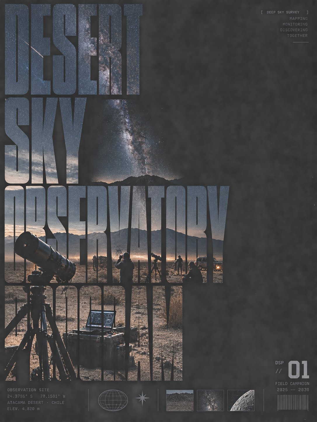
窄长字嵌影视觉切片高原输电巡检海报
- 模型
- ChatGPT
- 来源
- @xiaoxiaodong
- 收录
- 2026-10-11
提示词
3,336 字
Let the future theme first be compressed into a set of recognizable main images, then fully embed the images into large, narrow, bold characters occupying the core of the screen: what is seen at first glance is not independent photos and titles, but a huge visual slice formed by text outlines, internal scenes, and black whitespace. The glyphs bear the main composition, vertical strokes are densely arranged, horizontal space is compressed, and hard, almost mechanical black gaps are maintained between characters; the internal images are continuously misplaced across different character cavities but still share the same depth of field, horizon, or action path, allowing reading, viewing, and thematic narrative to occur simultaneously. The thematic content should be reconstructed as a documentary scene with foreground and background layers, clear subject scales, and local actions; figures or objects serve only as scale anchors in the image and do not individually snatch the title hierarchy. The background uses an almost pure black plane, external whitespace is restrained, and a small amount of equal-width, highly technical explanatory text, location information, or symbolic markings are quietly arranged at the bottom, forming a sense of a data archive beneath the main visual. The color palette is skeletal with a black base and low-saturation cool-colored imagery, allowing the theme itself to provide a small amount of natural color, but overall remaining grayish, cool, and low-decoration; light is like outdoor documentary photography, with brightness and darkness determined by real scenery, without adding commercial gradients. There should be slight cropping, compression, and a sense of print translation between the intra-character images and the glyph edges; local details can be rough but not messy, maintaining clear recognizability, hard edges, and slightly uneven alignment between image and text. The font is not a designated library: use a transferable narrow-tall structure, heavy straight strokes, tight tracking, shallow narrow inner cavities, simple terminals, and a few sharp turns; let different writing systems reorganize strokes, cavities, connections, and reading rhythms according to their own glyph topology to ensure the target text remains naturally recognizable. Avoid shrinking photos into ordinary backgrounds, floating titles on top of pictures, over-beautification, roundness and cuteness, rich decoration, soft focus, neon, gradient backgrounds, or sterile digital typography. —————— Implement the theme as a plateau power transmission line inspection poster: use rock ochre-brown as the primary color, overlaid with lead gray, low-saturation cyan-green, and faint safety yellow, with low-angle side light strengthening the realistic terrain; giant narrow characters are horizontally divided into two groups, with internal images misaligned and connected along the path of diagonal power towers-ridges-inspection personnel, the main subject concentrated in the bottom left and expanding to the top right, with black whitespace suppressing the density around the edges; the title adopts a three-level hierarchy with small text guidance in the top left, giant central characters for weight-bearing, and technical data secondary arrangement at the bottom, with a vertical 3:4 aspect ratio.
768 字
让未来主题先被压缩成一组可辨识的主体影像,再把影像完整嵌入占据画面核心的大型窄长粗体字中:第一眼看到的不是独立照片与标题,而是文字轮廓、内部景象和黑色留白共同形成的巨大视觉切片。字形承担主要构图,竖向笔画密集排列,横向空间被压缩,字与字之间保留硬朗、近乎机械的黑色间隙;内部图像在不同字腔中连续错位,但仍共享同一条景深、地平线或动作路径,使阅读、观看和主题叙事同时发生。主题内容应重建为具有远近层次、明确主体尺度和局部动作的纪实场景,人物或物件只作为影像中的尺度锚点,不单独抢夺标题层级。背景使用近乎纯黑的平面,外围留白克制,底部安静排列少量等宽、技术感强的说明文字、地点信息或符号标记,形成主视觉下方的资料档案感。色彩以黑底和低饱和冷色影像为骨架,允许主题自身提供少量自然色,但整体保持偏灰、偏冷、低装饰;光线像户外纪实摄影,明暗由真实景物决定,不添加商业渐变。字内图像与字形边缘应有轻微裁切、压缩和印刷转译感,局部细节可粗糙但不能脏乱,保留清晰识别度、硬边和不完全均匀的图文贴合。字体不是指定字库:使用可迁移的窄体高字面结构、厚重直线笔画、紧凑字距、浅窄内腔、简洁端点与少量锐利转折;让不同文字系统根据自身字形拓扑重新组织笔画、字腔、连接和阅读节奏,确保目标文字仍能自然辨认。避免把照片缩成普通背景、让标题浮在图片上、过度美化、圆润可爱、丰富装饰、柔焦、霓虹、渐变背景或整齐无菌的数字排版。

——————
将主题落地为高原输电线路巡检海报:以岩石赭褐为主色,叠加铅灰、低饱和青绿与微弱的安全黄,低角度侧光强化真实地形;巨型窄长字横向分成两组,内部影像沿斜向电塔—山脊—巡检人员路径错位衔接,主体集中在左下并向右上展开,黑色留白压住四周密度;标题采用左上小字引导、中央超大字承重、底部技术资料次级排列的三级层级,画幅为竖版 3:4。