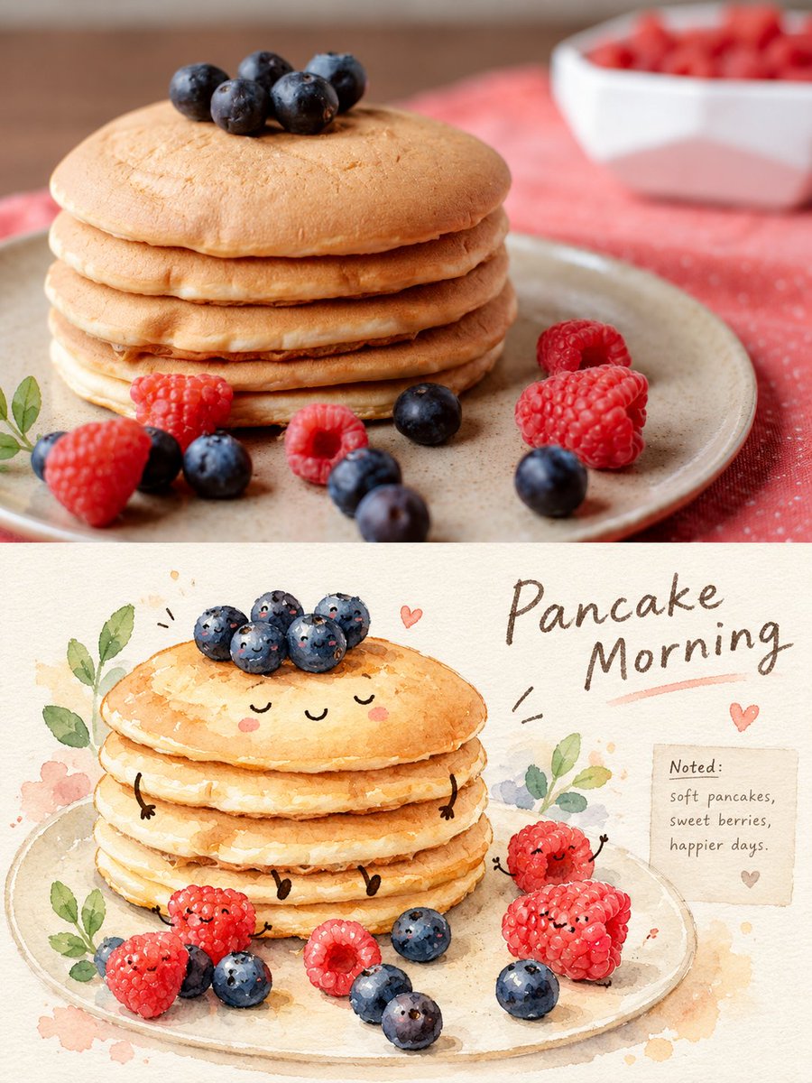
真实摄影与治愈水彩食物拟人对比海报
- 模型
- ChatGPT
- 来源
- @Hamburgerai
- 收录
- 2026-10-11
提示词
3,175 字
Use one input real photo to generate a vertical 3:4 top-bottom contrast editing journal poster. The upper half strictly preserves the real photography of the input photo: the subject identity, quantity, pose/placement, key outlines, original lighting, perspective, and background relationships must be accurate; the photo only undergoes slight publication-style color grading and cannot be turned into an illustration. The lower half must be a "healing watercolor food personification journal" redraw of the same photo content: extract the subject and main supporting elements from the original photo and reorganize them into a transparent watercolor illustration on a cream-white paper page; preserve recognizable shapes, colors, and spatial clues, but allow for shrinking, cropping, white space, and changes in information density. The subject can be personified as a gentle and cute character on paper, using minimalist small eyes, a smile or sleepy expression, light blush, short hands and feet or a peeking body; personification can only occur in the lower redraw area and cannot change the identity, quantity, and action relationships of the original subject. Add fine pencil/fineliner outlines, translucent watercolor blooming, wet-and-dry overlapping pigment edges, paper fibers, slight water stains, and hand-painted unevenness. Around the subject, only add a small amount of journal elements extended from the photo facts, such as leaves/branches, fruits, tableware, small desktop items, hearts, star points, arrows, observation circles, and material fields; do not crowd with stickers, do not use fixed travel templates. The lower half retains a large area of cream-white space, with a small amount of real and readable handwritten English short titles (prioritize subject names or scene themes, maximum 2–4 words), a small observation field, and a very short gentle observation sentence written on the paper; the text looks like it is handwritten on the paper and cannot include brands, URLs, QR codes, fake Chinese, or long paragraphs. The overall feel is like a quiet, warm watercolor observation journal with a slight children's picture book feel; colors are extracted and softened from the input photo, preserving natural blues, reds, yellows, greens, and original food colors, without a fixed single color scheme. Strict layout constraints: top and bottom each occupy about half, with a clear horizontal boundary; prohibit side-by-side, prohibit triptychs/nine-square grids, prohibit stitching multiple different photos together, prohibit original/AI image icons, and prohibit watermarks. The upper half is the complete real photo, and the lower half is a style redraw of the same scene and subject; the two must be clearly comparable. Do not make the lower half a proportional tracing of the original image; the scale of the subject, information density, or spatial organization must be changed through personified characters, paper white space, handwritten information, and the watercolor medium. Maintain the identity, quantity, key actions, and main structures of all real subjects, and do not add characters, places, or irrelevant props out of thin air.
787 字
使用一张输入真实照片,生成一张竖版 3:4 的上下对比编辑手账海报。上半部严格保留输入照片的真实摄影:主体身份、数量、姿态/摆放、关键轮廓、原始光线、视角和背景关系都要准确,照片只做轻微出版物调色,不能画成插画。下半部必须是同一张照片内容的“治愈水彩食物拟人手账”转绘:从原照片提取主体和主要陪衬,把它们重组为米白纸页上的透明水彩插画;保留可辨认的形体、颜色和空间线索,但允许缩小、裁切、留白和改变信息密度。主体可被拟人化为温和可爱的纸上角色,使用极简小眼睛、微笑或困倦表情、淡淡腮红、短手短脚或探出的身体;人物化只能发生在下半转绘区,且不能改变原主体的身份、数量和动作关系。加入细铅笔/针管笔轮廓、半透明水彩晕染、干湿交叠的颜料边缘、纸纤维、轻微水渍和手绘不均匀感。围绕主体只添加从照片事实延伸出的少量手账元素,例如叶枝、果实、餐具、桌面小物、心形、星点、箭头、观察圈和材料字段;不要堆满贴纸,不要套用固定旅游模板。下半部保留大面积米白留白,在纸面上写入少量真实可读的手写英文短标题(优先使用主体名称或场景主题,最多 2–4 个词)、一个小型观察字段和一句极短的温柔观察句;文字像手写在纸上,不能出现品牌、网址、二维码、假中文或长段落。整体像一本安静、温暖、带轻微儿童绘本感的水彩观察手账,色彩从输入照片提取并柔化,保留自然的蓝、红、黄、绿和食物原色,不固定单一配色。

严格版式约束:上下各占约一半,水平分界清楚;禁止左右并排,禁止三联/九宫格,禁止把多张不同照片拼在一起,禁止原图/AI图角标、禁止水印。上半是完整真实照片,下半是同场景同主体的风格转绘,二者必须明显可对照。不要把下半做成原图的等比例描摹;必须通过拟人角色、纸面留白、手写信息和水彩媒介改变主体尺度、信息密度或空间组织。保持所有真实主体的身份、数量、关键动作和主要结构,不凭空增加人物、地点或无关道具。